


Coursework
Projects I have worked hard to perfect during my years at Oklahoma State University.
Merchandised Store
In my Visual Merchandising class, we were instructed to create a full retail store on SketchUp to then be rendered in Enscape. My store was created for the online brand, Faith Connexion and all design elements have been covered in the featured design brief created in InDesign. This store is my favorite project to date and I am incredibly proud of my design and the way it meshes with the brand image of Faith Connexion.


An explanation of my design principles and the inspirational elements is included in the document above. This is one of the pieces I am most proud of and am so happy with the overall design and aesthetics used for this brand.


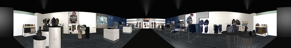
Visual Merchandising
In my Visual Merchandising class, we were instructed to create a full retail store on Mockshop with coordinating products and a design layout that promoted multi-item sales. My store has been designed for a men's clothing line and these are the final images.


Webpage Design
In my Digital Retailing class, we were instructed to create a full retail website on Shopify with products and everything needed to operate a digital store. These are photos of the final design of my shop.


Merchandised Window Display
One assignment within my Visual Merchandising class was a field assignment where we were required to create a merchandising display for a small boutique located in Stillwater. This project was completed at Greige Goods in the form of a window display with my classmate, Emma Stewart.
Before
After
 |  |
|---|---|
 |  |
 |
 |  |
|---|---|
 |  |
 |  |
 |  |
 |  |
Graphic Design
Various mood boards, illustrator, and photoshop projects completed during my time at Oklahoma State. Includes a full magazine created on InDesign for my Visual Communication flagship project.
 This inspiration board was made as a directive for the store I created on SketchUp. It was based off the brand Faith Connexion and was made to complement the merchandise of the online-only brand. |  The first project in my visual merchandising class was a window display created in photoshop. My assigned section was Fall Streetwear for Tweens. The apparel was all sourced from WGSN and colored in Illustrator to match the theme of my display. |  For my final project in my Tech & Visual Communication class, we used InDesign to develop a full magazine based off our interests. My final work is linked here so that you can see the project I am most proud of from this semester. The link to the full magazine is embedded in the image for full viewing capability |  In this project, we were told to create a mood board that defines who we are, and this was my final work. Everything chosen represents what I love or what I want my future career to consist of. The images represent how I want my work to be bold and fun, but also sophisticated and classic. |  My mood board for Ralph Lauren's S/S '22 line with suggested changes made depending on trend analytics I performed based on WGSN. |
|---|---|---|---|---|
 For my Heritage of Dress class, as part of a group project we redesigned clothing from a decade in history to fit into the styles of today. We then decided how we would market those items and determined the merchandising and competitive advantages we would have with our new line. |  Designed on Illustrator by using the pen tool as a fun design during my free time. |
Design Projects
I took a class called Principles of Design freshman year, and these were the projects I created during that time. Each has a special meaning and has taught me so much about design and what should be done to create a visually interesting work of art.

For this project we were told to create an abstract form using a grid. The version on the left is the original line art, and then the one on the right is the second half of the project where we were told to create a grayscale artwork out of our original lines.

Part 1 of the project where we created lines using a grid system to create symmetry and visual interest.

Part 2 of the project which involved recreating our original design and then painting a grayscale pattern over the top of it.
For this project we were told to create an abstract form using a grid. The version on the left is the original line art, and then the one on the right is the second half of the project where we were told to create a grayscale artwork out of our original lines.

For this project, we were instructed to create both 2-D and 3-D compositions. My chosen concept was fake wealth, and I split this piece down the middle to show the two different sides. The white side is the luxury and wealth that is seen by everyone, while the black side shows that it really is a sad life with the world coming down around you. I drew all parts of the board myself and am really proud of it because it shows how far I have come this semester, as this was the last project we did.

This is the 3-D composition that I created to go along with the board I had created in the first part of the project. Like th board, this diorama is split down the center to show the two sides of this lifestyle. The white side is the luxury and opulence that everyone else sees, while the black side shows the world that is falling apart and the dark side of trying to live a life that impresses others.

This half of the board is used to portray the dark side of living a lavish lifestyle. I used an empty coin purse to show that trying to afford this lifestyle has completely b emptied their wallets. I also took some of the jewels and pearls from the white side and crushed them up to portray the broken lifestyle they chose to live.
For this project, we were instructed to create both 2-D and 3-D compositions. My chosen concept was fake wealth, and I split this piece down the middle to show the two different sides. The white side is the luxury and wealth that is seen by everyone, while the black side shows that it really is a sad life with the world coming down around you. I drew all parts of the board myself and am really proud of it because it shows how far I have come this semester, as this was the last project we did.
 For this project, we were asked to create a mood board using the elements of design. I chose to use the element of unity in the monochromatic color scheme, and then used layering and texture to create visual interest. |  For this project, we were told to choose a landmark and create a pattern that encompassed that place. I chose St. Basil's Cathedral in Moscow, Russia. I used the pattern on one of the spires as the background for my piece and created a warped look on the lines so that it was as if you were actually looking at one of the domes of the cathedral. |  We were told to use still life elements to create a surrealist artwork for this project, and I chose to focus on a crown from the cover of the book "Glass Sword." I also used a chess piece, the phases of the moon but using the earth instead, and a butterfly that makes you wonder what the size ratio is throughout the work. At the bottom I used two books stacked on one another and created a cloudy sky on the top one with a lightning storm on the bottom. |
|---|